Visual Identity

Brand Guidelines

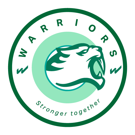
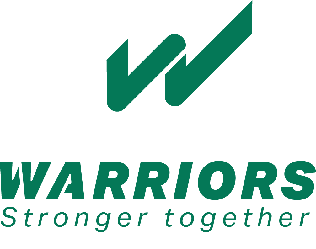
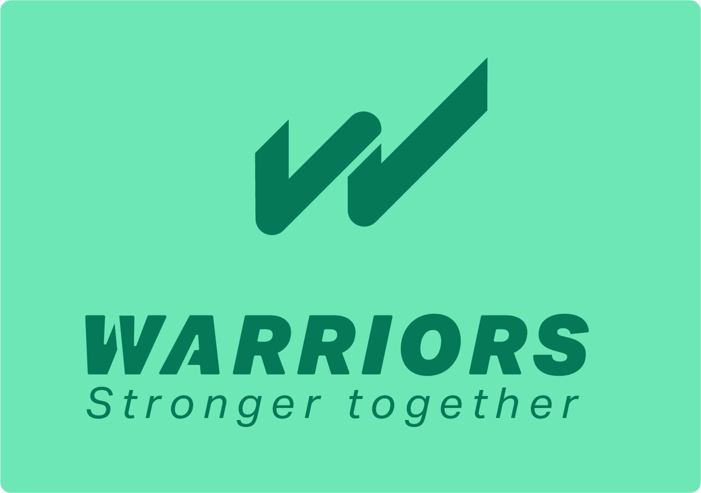
Our visual identity, color palette, and logo assets

Color Palette

Our colors reflect energy, community, and strength. Each group serves a distinct purpose in our visual system.

Greens

Primary brand colors

#16a34a

Core

#16a34a

#86efac

Flow

#86efac

#4ade80

Vital

#4ade80

#22c55e

Move

#22c55e

#15803d

Deep

#15803d

Greys

Neutral tones

#1f2937

Iron

#1f2937

#9ca3af

Ash

#9ca3af

#4b5563

Steel

#4b5563

#111827

Night

#111827

#030712

Void

#030712

Pinks

Accent colors

#ec4899

Unity

#ec4899

#fbcfe8

Care

#fbcfe8

#f9a8d4

Warm

#f9a8d4

#db2777

Power

#db2777

#9d174d

Root

#9d174d

Alternates

Supporting colors

#38bdf8

Sky

#38bdf8

#fcd34d

Spark

#fcd34d

Logo Variants

Download official Warriors Team Brisbane logo assets for approved use.

Primary Logo

Primary Logo

.png

Download
Dark Logo

Dark Logo

.png

Download
Circle Logo

Circle Logo

.png

Download
With Background

With Background

.png

Download
With Jaguar

With Jaguar

.png

Download
With Slogan

With Slogan

.png

Download
Secondary

Secondary

.png

Download
OG Image

OG Image

.png

Download

Typography

Inter is our primary typeface, chosen for its clean geometry and excellent readability across all sizes.

Aa

Inter

Primary Typeface

400 Regular

The quick brown fox jumps over the lazy dog

500 Medium

The quick brown fox jumps over the lazy dog

600 Semibold

The quick brown fox jumps over the lazy dog

700 Bold

The quick brown fox jumps over the lazy dog

900 Black

The quick brown fox jumps over the lazy dog

Brand Presentation

Download the complete brand deck for presentations and partner use.

Warriors Brand Presentation

warriors-brand-presentation.pdf

Usage Guidelines

Follow these rules to keep the Warriors brand consistent and professional.

Do

  • Use green (Core #16a34a) as the primary brand color across all touchpoints.
  • Always ensure sufficient contrast between text and background colors for readability.
  • Use dark backgrounds (Night/Void) for hero and feature sections.
  • Use pink (Unity) sparingly as an accent to highlight key elements.
  • Maintain clear space around the logo equal to at least half the logo height.

Don't

  • Stretch, distort, rotate, or alter the proportions of any logo variant.
  • Use pink as a primary color -- it is an accent only.
  • Place the logo on busy or low-contrast backgrounds where it becomes illegible.
  • Add drop shadows, outlines, gradients, or visual effects to the logo.
  • Replace Inter with another typeface in official materials.